
 Lana_C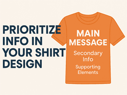
The 3-Second Rule
Most people will only glance at your shirt for a few seconds. If they can't identify the main message immediately, the design is trying to communicate too much at once.
Ask yourself:
- What is the one thing people should remember?
- What information supports that message?
- What can be reduced, moved, or removed?
Design with Purpose: What Matters Most on a T-Shirt
When designing a custom t-shirt, not all information deserves equal attention. Whether you're creating shirts for a fundraiser, a school event, or a company promotion, some details need to stand out, while others should play a supporting role. Prioritizing information helps create a clear and eye-catching layout that communicates your message effectively.
1. Establish a Visual Hierarchy
Visual hierarchy is the order in which people notice elements in your design. Use size, placement, bold fonts, and color contrast to make the most important parts pop.
-
Top Priority: Main message (e.g., event name, slogan, or organization)
-
Secondary Info: Date, location, or theme
-
Supporting Elements: Sponsor logos, hashtags, or small graphics

A Simple Test
Before ordering, step back from your screen or zoom your design out to thumbnail size.
If the most important message isn't obvious immediately, simplify the design until it is.
The best shirt designs communicate their purpose before someone has time to read every word.